
- 1. transition-property
- 2. transition-duration
- 3. transition-timing-function
- 4. transition-delay
- 5. transition
- Reference
트랜지션(transition)은 CSS 프로퍼티의 값이 변화할 때, 프로퍼티 값의 변화가 일정 시간(duration)에 걸쳐 일어나도록 하는 것이다. 예를 들어 아래의 예제를 살펴보자. div 요소는 기본 상태에서 hover 상태로 변화할 때, CSS 프로퍼티 border-radius와 background 프로퍼티의 값이 변화한다.
<!DOCTYPE html>
<html>
<head>
  <style>
    div {
      width: 100px;
      height: 100px;
      background: red;
    }
    div:hover {
      border-radius: 50%;
      background: blue;
    }
  </style>
</head>
<body>
  <div></div>
</body>
</html>
상태 변화에 따라 CSS 프로퍼티가 변경되면 프로퍼티 변경에 따른 표시의 변화(transition)는 지체없이 즉시 발생한다. 위 예제의 경우, div 요소에 마우스가 올라가서 hover 상태가 되면 div 요소의 border-radius, background 프로퍼티의 값이 즉시 변경된다.
트랜지션(transition)은 상태 변화에 동반하여 변경되는 CSS 프로퍼티 값에 의한 표시의 변화를 부드럽게 하기 위해 애니메이션 속도를 조절한다. 즉, 프로퍼티 값의 변경이 표시의 변화에 즉시 영향을 미치게 하는 대신 그 프로퍼티 값의 변화가 일정 시간(duration)에 걸쳐 일어나도록 하는 것이다.
위 예제에 트랜지션 효과를 부여해 보자.
<!DOCTYPE html>
<html>
<head>
  <style>
    div {
      width: 100px;
      height: 100px;
      background: red;
      /* 트랜지션 효과: 모든 프로퍼티의 변화를 2초에 걸쳐 전환한다. */
      transition: all 2s;
    }
    div:hover {
      border-radius: 50%;
      background: blue;
    }
  </style>
</head>
<body>
  <div></div>
</body>
</html>
위 예제에서는 div 요소에 마우스가 올라갈 때(hover on)와 마우스가 내려올 때(hover off) border-radius, background 프로퍼티 값의 변화가 발생한다. 그리고 이들 프로퍼티 값의 변화를 2초에 걸쳐 이루어지도록 설정한 것이다.
div 셀렉터의 룰셋에 트랜지션을 설정하면 마우스가 올라갈 때(hover on)와 마우스가 내려올 때(hover off) 모두 트랜지션이 발동한다. 하지만 div:hover 셀렉터의 룰셋에 트랜지션을 설정하면 마우스가 올라갈 때(hover on)는 트랜지션이 발동하지만 마우스가 내려올 때(hover off)는 트랜지션이 발동하지 않는다.
<!DOCTYPE html>
<html>
<head>
  <style>
    div {
      width: 100px;
      height: 100px;
      background: red;
    }
    div:hover {
      background: blue;
      border-radius: 50%;
      /* hover on에서만 발동한다. */
      transition: all 2s;
    }
  </style>
</head>
<body>
  <div></div>
</body>
</html>
transition은 자동으로 발동되지 않는다. :hover와 같은 가상 클래스 선택자(Pseudo-Classes) 또는 JavaScript의 부수적인 액션에 의해 발동한다. 위 예제의 div 요소에 적용된 트랜지션은 이와 같은 부수적 액션없이는 어떤 효과도 볼 수 없다.
<!DOCTYPE html>
<html>
<head>
  <style>
    div {
      width: 100px;
      height: 100px;
      background: red;
      transition: all 2s;
    }
    .hover {
      background: blue;
      border-radius: 50%;
    }
  </style>
</head>
<body>
  <div></div>
<script>
  const elem = document.querySelector('div');

  elem.addEventListener('mouseover', function () {
    this.classList.add('hover');
  });

  elem.addEventListener('mouseleave', function () {
    this.classList.remove('hover');
  });
</script>
</body>
</html>
만약 트랜지션이 자동 발동(self-invoking transition)하도록 하고 싶다면 CSS 애니메이션을 사용하도록 한다.
transition의 프로퍼티는 아래와 같다.
| 프로퍼티 | 설명 | 기본값 |
|---|---|---|
| transition-property | 트랜지션의 대상이 되는 CSS 프로퍼티를 지정한다 | all |
| transition-duration | 트랜지션이 일어나는 지속시간(duration)을 초 단위(s) 또는 밀리 초 단위(ms)로 지정한다 | 0s |
| transition-timing-function | 트랜지션 효과를 위한 수치 함수를 지정한다. | ease |
| transition-delay | 프로퍼티가 변화한 시점과 트랜지션이 실제로 시작하는 사이에 대기하는 시간을 초 단위(s) 또는 밀리 초 단위(ms)로 지정한다 | 0s |
| transition | 모든 트랜지션 프로퍼티를 한번에 지정한다 (shorthand syntax) |
1. transition-property
transition-property 프로퍼티는 트랜지션의 대상이 되는 CSS 프로퍼티명을 지정한다. 지정하지 않는 경우 모든 프로퍼티가 트랜지션의 대상이 된다. 복수의 프로퍼티를 지정하는 경우 쉼표(,)로 구분한다.
<!DOCTYPE html>
<html>
<head>
  <style>
    div {
      width: 100px;
      height: 50px;
      background-color: red;
      margin-bottom: 10px;
      transition-property: width, background-color;
      transition-duration: 2s, 2s;
    }
    div:hover {
      width: 300px;
      background-color: blue;
    }
  </style>
</head>
<body>
  <div></div>
</body>
</html>
주의해야 할 사항은 모든 CSS 프로퍼티가 트랜지션의 대상이 될 수 없다는 것이다. 예를 들어 width, font-size, background-color 등은 하나의 범주(width, font-size는 크기, background-color는 색상)안에서 값이 변화하지만 display 프로퍼티는 그렇지 않다.
트랜지션의 대상이 될 수 있는 CSS 프로퍼티는 다음과 같다.
// Box model
width height max-width max-height min-width min-height
padding margin
border-color border-width border-spacing
// Background
background-color background-position
// 좌표
top left right bottom
// 텍스트
color font-size font-weight letter-spacing line-height
text-indent text-shadow vertical-align word-spacing
// 기타
opacity outline-color outline-offset outline-width
visibility z-index
또한 요소의 프로퍼티 값이 변화하면 브라우저는 프로퍼티 값의 변화에 영향을 받는 모든 요소의 기하값(위치와 크기)를 계산하여 layout 작업을 수행한다. 이것은 브라우저에게 스트레스를 주어 성능 저하의 요인이 된다. 심지어 다수의 자식 요소를 가지고 있는 요소(예를 들어 body 요소)가 변경되면 모든 자식 요소의 기하값이 재계산될 수도 있다. 따라서 layout에 영향을 주는 트랜지션 효과는 회피하도록 노력해야 한다.
layout에 영향을 주는 프로퍼티는 다음과 같다.
width height padding margin border
display position float overflow
top left right bottom
font-size font-family font-weight
text-align vertical-align line-height
clear white-space
2. transition-duration
transition-duration 프로퍼티는 트랜지션에 일어나는 지속시간(duration)을 초 단위(s) 또는 밀리 초 단위(ms)로 지정한다. 프로퍼티값을 지정하지 않을 경우 기본값 0s이 적용되어 어떠한 트랜지션 효과도 볼 수 없다.
<!DOCTYPE html>
<html>
<head>
  <style>
    div {
      width: 100px;
      height: 50px;
      padding: 10px;
      color: white;
      background-color: red;
      margin-bottom: 10px;
      transition-property: width, opacity;
    }
    div:nth-child(1) {
      transition-duration: 0.5s;
    }
    div:nth-child(2) {
      transition-duration: 2s, 1s;
    }
    div:nth-child(3) {
      transition-duration: 5s, 2.5s;
    }
    div:hover {
      width: 300px;
      opacity: .1;
    }
  </style>
</head>
<body>
  <div>0.5s</div>
  <div>2s, 1s</div>
  <div>5s, 2.5s</div>
</body>
</html>
transition-duration 프로퍼티값은 transition-property 프로퍼티값과 1:1 대응한다. 아래의 경우, width 프로퍼티는 2초의 지속시간을 갖는다(2초에 걸쳐 변화한다).
div {
  transition-property: width;
  transition-duration: 2s;
}
아래의 경우, width 프로퍼티는 2초, opacity 프로퍼티는 4초의 지속시간을 갖는다.
div {
  transition-property: width, opacity;
  transition-duration: 2s, 4s;
}
또한 transition 프로퍼티만으로 축약 표현이 가능하다.
div {
  /* shorthand syntax */
  transition: width 2s, opacity 4s;
}
아래의 경우, width 프로퍼티는 2초, opacity 프로퍼티는 1초, left 프로퍼티는 2초, top 프로퍼티는 1초의 지속시간을 갖는다.
div {
  transition-property: width, opacity, left, top;
  transition-duration: 2s, 1s;
}
3. transition-timing-function
트랜지션 효과의 변화 흐름, 시간에 따른 변화 속도와 같은 일종의 변화의 리듬을 지정한다.
대부분의 타이밍 함수는 큐빅 베이지어(cubic bezier)를 정의하는 네 점에 의해 정의되므로 상응하는 함수의 그래프로 제공해서 명시할 수 있다. transition-timing-function 프로퍼티값으로 미리 정해둔 5개의 키워드가 제공된다. 기본값은 ease이다.
| 프로퍼티값 | 효과 | 그래프 |
|---|---|---|
| ease | 기본값. 느리게 시작하여 점점 빨라졌다가 느리지면서 종료한다. | 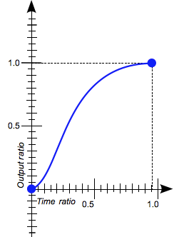 |
| linear | 시작부터 종료까지 등속 운동을 한다. | 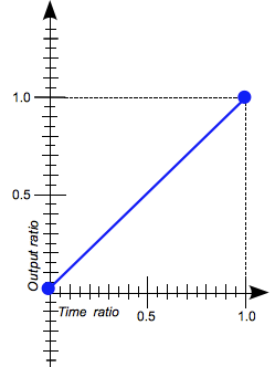 |
| ease-in | 느리게 시작한 후 일정한 속도에 다다르면 그 상태로 등속 운동한다. | 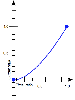 |
| ease-out | 일정한 속도의 등속으로 시작해서 점점 느려지면서 종료한다. | 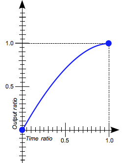 |
| ease-in-out | ease와 비슷하게 느리게 시작하여 느리지면서 종료한다. | 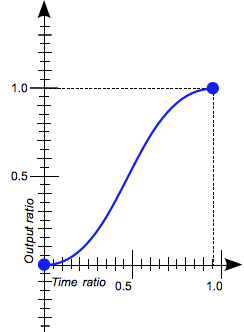 |
<!DOCTYPE html>
<html>
<head>
  <style>
    div {
      font: bold 16px/50px "Open Sans";
      color: white;
      text-align: center;
      width: 100px;
      height: 50px;
      background-color: red;
      margin-bottom: 10px;
      transition: width 2s;
    }
    div:nth-child(1) {
      transition-timing-function: ease;
    }
    div:nth-child(2) {
      transition-timing-function: linear;
    }
    div:nth-child(3) {
      transition-timing-function: ease-in;
    }
    div:nth-child(4) {
      transition-timing-function: ease-out;
    }
    div:nth-child(5) {
      transition-timing-function: ease-in-out;
    }
    div:hover {
      width: 300px;
    }
  </style>
</head>
<body>
  <h3>transition-timing-function</h3>
  <div>ease</div>
  <div>linear</div>
  <div>ease-in</div>
  <div>ease-out</div>
  <div>ease-in-out</div>
</body>
</html>
4. transition-delay
프로퍼티가 변화한 시점과 트랜지션이 실제로 시작하는 사이에 대기하는 시간을 초 단위(s) 또는 밀리 초 단위(ms)로 지정한다. 즉, transition-delay로 대기 사간을 지정하여 프로퍼티의 값이 변화하여도 즉시 트랜지션이 실행되지 않고, 일정 시간 대기한 후 트랜지션이 실행되도록 한다.
<!DOCTYPE html>
<html>
<head>
  <style>
    div {
      font: bold 16px/50px "Open Sans";
      color: white;
      text-align: center;
      width: 100px;
      height: 50px;
      background-color: red;
      margin-bottom: 10px;
      transition: width 1s;
    }
    div:nth-of-type(1) {
      transition-delay: 0s;
    }
    div:nth-of-type(2) {
      transition-delay: 1s;
    }
    div:nth-of-type(3) {
      transition-delay: 3s;
    }
    div:hover {
      width: 300px;
    }
  </style>
</head>
<body>
  <h3>transition-delay</h3>
  <div>0s</div>
  <div>1s</div>
  <div>3s</div>
</body>
</html>
5. transition
모든 트랜지션 프로퍼티를 한번에 지정할 수 있는 shorthand이다. 값을 지정하지 않은 프로퍼티에는 기본값이 지정된다. 지정 방법은 다음과 같다.
transition: property duration function delay
transition-duration은 반드시 지정해야 한다. 지정하지 않는 경우 기본값 0이 셋팅되어 어떠한 트랜지션도 실행되지 않는다. 기본값은 아래와 같다.
all 0 ease 0
<!DOCTYPE html>
<html>
<head>
  <style>
    div {
      font: bold 0.5em/50px "Open Sans";
      color: white;
      text-align: center;
      width: 100px;
      height: 50px;
      margin-bottom: 10px;
      background-color: red;
    }
    div:nth-of-type(1) {
      /* property duration function delay */
      transition: width 1s ease-in 1s;
    }
    div:nth-of-type(2) {
      /* duration */
      transition: 1s
    }
    div:nth-of-type(3) {
      /* property duration */
      transition: width 1s
    }
    div:nth-of-type(4) {
      /* duration function */
      transition: 1s ease-in;
    }
    div:nth-of-type(5) {
      /* duration delay*/
      transition: 1s 1s;
    }
    div:hover {
      width: 300px;
    }
  </style>
</head>
<body>
  <div>width 1s ease-in 1s</div>
  <div>1s</div>
  <div>width 1s</div>
  <div>1s ease-in</div>
  <div>1s 1s</div>
</body>
</html>
| Property | Chrome | Edge | IE | Firefox | Safari | Opera |
|---|---|---|---|---|---|---|
| transition-* | 26.0 | 12.0 | 10.0 | 16.0 | 6.1 | 12.1 |
| prefix | 4.0 | 4.0 | 3.1 | 10.5 |