
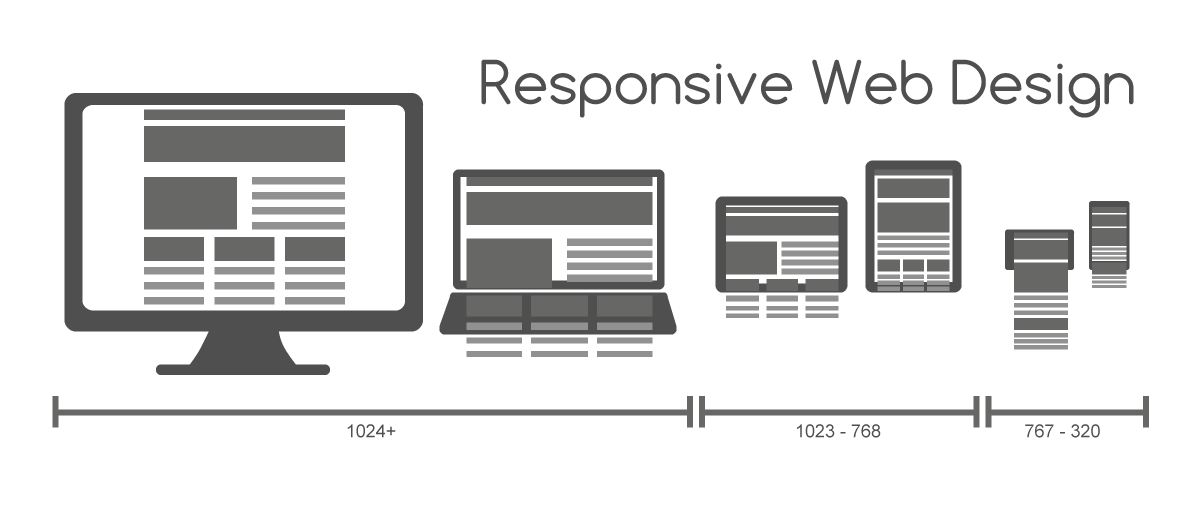
앞에서 살펴본 layout 에는 사실 몇가지 문제가 숨겨져 있다. 그 문제를 해결할 열쇠는 바로 Responsive Web Design이다.
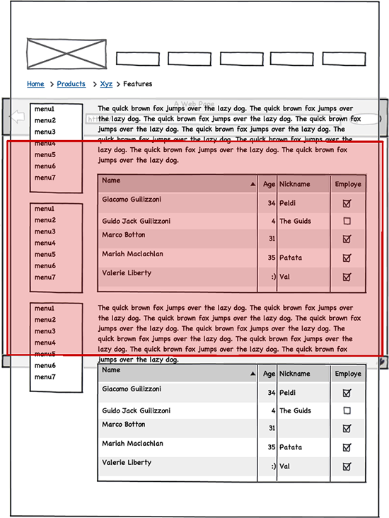
먼저 어떤 문제가 있는지 알아본다. 화면폭을 좁히면 아래 그림과 같이 화면이 망가지는데 이것는 HTML 요소에 고정폭을 지정하여 가로 스크롤을 발생시키지 않으면 해결이 어렵다.
그리고 모바일과 같이 작은 해상도의 디바이스에서 접근했을 때 화면이 너무 작아져 가시성에 문제가 발생한다.
1. Responsive Web Design 개요
사용자가 어떤 디바이스로 웹사이트를 방문할 지 알 수 없다. layout은 방문자의 화면 해상도를 고려하여야 한다. 가로폭이 너무 큰 layout을 작성하면 작은 해상도 모니터로 방문하였을 때 가로 스크롤이 생겨서 사용이 불편할 수도 있다.
또한 스마트폰이나 태블릿 등 모바일 기기는 화면이 작기 때문에 가독성에 더욱 신경써야 한다. 보통 웹사이트가 축소되어 가로 스크롤 없이 콘텐츠를 볼 수 있으나 글자가 너무 작아지기 때문이다. 데스크탑용, 테블릿용, 모바일용 웹사이트를 별도 구축할 수도 있지만 One Source Multi Use의 관점에서 올바른 해결책은 아니다.
이러한 문제를 해결하는 방법 중의 하나가 반응형 웹디자인(Responsive Web Design)이다. 화면 해상도에 따라 가로폭이나 배치를 변경하여 가독성을 높이는 것이다. 즉, 하나의 웹사이트를 구축하여 다양한 디바이스의 화면 해상도에 최적화된 웹사이트를 제공하는 것이다.
또한 최근 모바일 웹페이지는 대부분 애플리케이션의 형태로 진화하고 있어 앱인지 웹인지 구분이 어려울 정도이다. HTML5/CSS3/Javascript만으로 네이티브 앱과 차이를 느낄 수 없는 앱을 만들 수 있다. 다음은 최근 관심을 끌고 있는 Web App Framework이다.
1.1 viewport meta tag
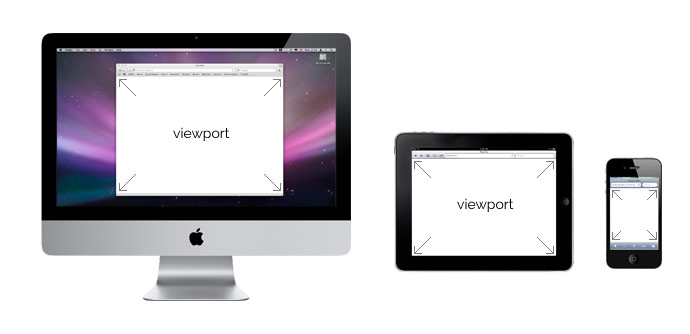
viewport란 웹페이지의 가시영역을 의미한다. viewport는 디바이스에 따라 차이가 있다. 예를 들어 모바일 브라우저는 주화면이 세로 화면이고 윈도우 resize가 불가하며 화면 터치를 사용하는 등 데스크탑 브라우저와 구성이나 형태가 다르다. 또한 모바일의 화면은 데스크탑 화면보다 훨씬 작으므로 데스크탑용 웹페이지를 그대로 모바일에 출력하면 가독성이 현저히 나빠진다. 따라서 viewport를 이용하여 디바이스의 특성과 디바이스의 화면 크기 등을 고려하여 각종 디바이스 사용자에게 최적화된 웹페이지를 제공할 수 있다.
meta tag는 브라우저 혹은 검색엔진최적화(SEO)를 위해 검색엔진에게 메타데이터를 전달하기 위해 사용된다.
viewport meta tag는 브라우저의 화면 설정과 관련된 정보를 제공한다.
| 프로퍼티 | Description | 사용예 |
|---|---|---|
| width | viewport 너비(px). 기본값: 980px | width=240 |
| width=device-width | ||
| height | viewport 높이(px) | height=800 |
| width=device-height | ||
| initial-scale | viewport초기 배율 | initial-scale=1.0 |
| user-scale | 확대 축소 가능 여부 | user-scale=no |
| maximum-scale | viewport 최대 배율 | maximum-scale=2.0 |
| minimum-scale | viewport 최소 배율 | minimum-scale=1.0 |
meta tag에서는 px단위를 사용하며 단위 표현은 생략한다. 복수개의 프로퍼티를 사용할 때는 쉼표(,)로 구분한다.
일반적으로 viewport meta tag는 모바일 디바이스에서만 적용된다.
<meta name="viewport" content="width=device-width, initial-scale=1.0">
위 예제는 가장 일반적인 viewport 설정이다. 가로폭을 디바이스의 가로폭에 맞추고 초기 화면 배율을 100%로 설정하는 것을 의미한다.
1.2 @media
이것은 서로 다른 미디어 타입(print, screen…)에 따라 각각의 styles을 지정하는 것을 가능하게 한다. 다음은 일반 화면(screen)과 인쇄장치 별로 서로 다른 style을 지정하는 예이다.
<!DOCTYPE html>
<html>
<head>
  <meta name="viewport" content="width=device-width, initial-scale=1.0">
  <style>
    @media screen {
      * { color: red; }
    }
    @media print {
      * { color: blue; }
    }
  </style>
</head>
<body>
  <h1>@media practice</h1>
  <p>Lorem ipsum dolor sit amet, consectetur adipisicing elit, sed do eiusmod tempor incididunt ut labore et dolore magna aliqua. Ut enim ad minim veniam, quis nostrud exercitation ullamco laboris nisi ut aliquip ex ea commodo consequat. Duis aute irure dolor in reprehenderit in voluptate velit esse cillum dolore eu fugiat nulla pariatur. Excepteur sint occaecat cupidatat non proident, sunt in culpa qui officia deserunt mollit anim id est laborum.</p>
</body>
</html>
반응형 웹디자인에 사용되는 핵심 기술은 @media이다.
@media을 사용하여 미디어 별로 style을 지정하는 것을 Media Query라 한다. 디바이스를 지정하는 것뿐만 아니라 디바이스의 크기나 비율까지 구분할 수 있다.
다음은 Media Query의 문법이다.
@media not|only mediatype and (expressions) {
  CSS-Code;
}
@media screen and (min-width: 480px) {
  body {
    background-color: lightgreen;
  }
}
아래의 표는 Media Query의 표현식에서 사용할 수 있는 프로퍼티이다.
| 프로퍼티 | Description |
|---|---|
| width | viewport 너비(px) |
| height | viewport 높이(px) |
| device-width | 디바이스의 물리적 너비(px) |
| device-height | 디바이스의 물리적 높이(px) |
| orientation | 디바이스 방향 (가로 방향: landscape, 세로방향: portrait) |
| device-aspect-ratio | 디바이스의 물리적 width/height 비율 |
| color | 디바이스에서 표현 가능한 최대 색상 비트수 |
| monochrome | 흑백 디바이스의 픽셀 당 비트수 |
| resolution | 디바이스 해상도 |
orientation을 제외한 모든 프로퍼티는 min/max 접두사를 사용할 수 있다.
W3C > Media Queries > Media features
일반적으로 반응형 웹 디자인은 viewport 너비(width 프로퍼티)를 기준으로 한다.
viewport의 width 프로퍼티를 이용하여 viewport 너비에 따라 반응하는 범위(breakpoint)를 지정할 수 있다.
/*==========  Mobile First Method  ==========*/
/* All Device */

/* Custom, iPhone Retina : 320px ~ */
@media only screen and (min-width : 320px) {

}
/* Extra Small Devices, Phones : 480px ~ */
@media only screen and (min-width : 480px) {

}
/* Small Devices, Tablets : 768px ~ */
@media only screen and (min-width : 768px) {

}
/* Medium Devices, Desktops : 992px ~ */
@media only screen and (min-width : 992px) {

}
/* Large Devices, Wide Screens : 1200px ~ */
@media only screen and (min-width : 1200px) {

}

/*==========  Non-Mobile First Method  ==========*/
/* All Device */

/* Large Devices, Wide Screens : ~ 1200px */
@media only screen and (max-width : 1200px) {

}
/* Medium Devices, Desktops : ~ 992px */
@media only screen and (max-width : 992px) {

}
/* Small Devices, Tablets : ~ 768px */
@media only screen and (max-width : 768px) {

}
/* Extra Small Devices, Phones : ~ 480px */
@media only screen and (max-width : 480px) {

}
/* Custom, iPhone Retina : ~ 320px */
@media only screen and (max-width : 320px) {

}
다음은 임의로 해상도를 3단계로 구분하여 breakpoint를 정의한 예제이다.
<!DOCTYPE html>
<html>
<head>
  <meta name="viewport" content="width=device-width, initial-scale=1.0">
  <style>
    /* 801px ~ */
    * { color: black; }
    /* ~ 800px */
    @media screen and (max-width: 800px) {
      * { color: blue; }
    }
    /* ~ 480px */
    @media screen and (max-width: 480px) {
      * { color: red; }
    }
  </style>
</head>
<body>
  <h1>@media practice</h1>
  <p>Lorem ipsum dolor sit amet, consectetur adipisicing elit, sed do eiusmod tempor incididunt ut labore et dolore magna aliqua. Ut enim ad minim veniam, quis nostrud exercitation ullamco laboris nisi ut aliquip ex ea commodo consequat. Duis aute irure dolor in reprehenderit in voluptate velit esse cillum dolore eu fugiat nulla pariatur. Excepteur sint occaecat cupidatat non proident, sunt in culpa qui officia deserunt mollit anim id est laborum.</p>
</body>
</html>
다음은 화면이 세로일 때, 가로일 때를 구분하는 예제이다. 주의할 점은 데스크탑은 언제나 가로 화면이기 때문에 device-width로 스마트폰의 해상도를 지정하지 않으면 데스크탑에서도 가로화면 시 style이 적용되는 문제가 발생한다.
<!DOCTYPE html>
<html>
<head>
  <meta name="viewport" content="width=device-width, initial-scale=1.0">
  <style>
    /* 세로  */
    * { color: black; }
    /* 가로 */
    /* Desktop의 화면은 가로화면(landscape)이므로 아래 rule이 적용된다. */
    /*
    @media screen and (orientation: landscape) {
      { color: blue; }
    }
    */

    /* Landscape */
    @media screen
      /* 디바이스가 모바일일때(device-width 0 ~ 768px) */
      and (max-device-width: 760px)
      /* 가로 */
      and (orientation: landscape) {
      * { color: blue; }
    }
  </style>
</head>
<body>
  <h1>@media practice: orientation</h1>
  <p>Lorem ipsum dolor sit amet, consectetur adipisicing elit, sed do eiusmod tempor incididunt ut labore et dolore magna aliqua. Ut enim ad minim veniam, quis nostrud exercitation ullamco laboris nisi ut aliquip ex ea commodo consequat. Duis aute irure dolor in reprehenderit in voluptate velit esse cillum dolore eu fugiat nulla pariatur. Excepteur sint occaecat cupidatat non proident, sunt in culpa qui officia deserunt mollit anim id est laborum.</p>
</body>
</html>
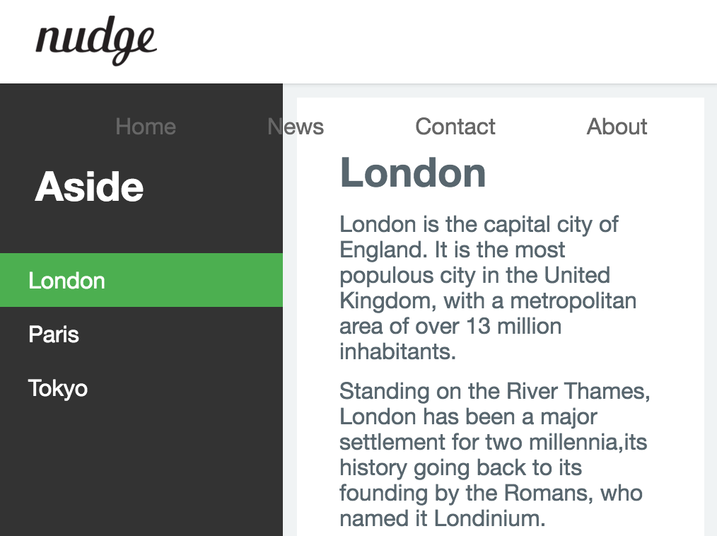
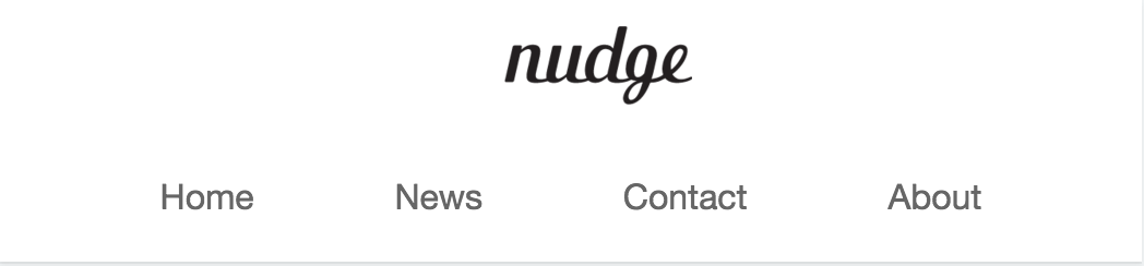
2. Responsive Navigation Bar
이제까지의 내용을 바탕으로 앞서 만들어본 예제를 Responsive Web Design에 맞추어 수정해 보자.
디바이스 해상도에 따라 반응할 수 있도록 viewport meta tag와 media query를 추가한다.
<!DOCTYPE html>
<html>
<head>
  <meta name="viewport" content="width=device-width, initial-scale=1.0">
  <style>
    /* Media Query */
    /* for Desktop: 801px ~ */

    /* for tablet: ~ 800px */
    @media screen and (max-width: 800px) {

    }
    /* for smartphone: ~ 480px */
    @media screen and (max-width: 480px) {

    }
  </style>
</head>
...
스마트폰, 태블릿, 데스크탑 그룹의 3단계로 구분하여 breakpoint를 정의하였다. Non Mobile First Method로 정의하였기 때문에 Media Query로 정의하지 않은 스타일은 데스크탑 그룹을 위한 코드가 된다.
/* for Desktop: 801px ~ */

/* for tablet: ~ 800px */
@media screen and (max-width: 800px) {
}
최대 viewport width를 800px로 한정하였다는 것은 화면 크기가 800px 이하인 디바이스(태블릿)를 위한 정의란 의미가 된다. 위 예제 내에 정의 되는 스타일은 화면 크기가 800px 이하인 디바이스에서 웹사이트가 표시될 때 실행된다.
/* for smartphone: ~ 480px */
@media screen and (max-width: 480px) {
}
최대 viewport width를 480px로 한정하였다는 것은 화면 크기가 480px 이하인 디바이스(스마트폰)를 위한 정의란 의미가 된다. 위 예제 내에 정의 되는 스타일은 화면 크기가 480px 이하인 디바이스에서 웹사이트가 표시될 때 실행된다.
CSS 적용 우선 순위 (Cascading Order)에 따라 나중에 선언된 스타일이 우선 적용된다. 따라서 Media Query는 기술 순서에 의미가 있다. 만일 스마트폰용 스타일을 태블릿용 스타일보다 먼저 기술하면 최종적으로 태블릿용 스타일이 적용된다. 따라서 Non Mobile First 방식의 경우, max-width의 값이 큰 것부터 기술하여 한다.
/* Media Query */
/* for Desktop: 801px ~ */

/* for smartphone: ~ 480px */
/*
Media Query는 기술 순서에 의미가 있다.
만일 스마트폰용 스타일을 태블릿용 스타일보다 먼저 기술하면 최종적으로 태블릿용 스타일이 적용된다.
Non Mobile First Method의 경우, max-width의 값이 큰 것부터 기술하여 한다.
*/
@media screen and (max-width: 480px) {

}

/* for tablet: ~ 800px */
@media screen and (max-width: 800px) {

}
일반적으로 Mobile-first 방식은 해상도가 작은 순서로, Non Mobile-first 방식은 해상도가 큰 순서로 기술한다.
2.1 Responsive Navigation Bar - Tablet
데스크탑 layout에서 화면이 작아질 때 header navigation bar가 header 영역 아래로 내려오는 현상이 발생하였다. 이를 보완하기 위해 다음과 같이 태블릿에서의 layout을 정의한다.
viewport width가 800px 이하가 되면 header 영역을 2단(logo영역과 navigation bar영역)으로 구분하기 위하여 header 영역의 높이를 현재(60px)의 2배로 넓힌다. 그리고 logo image과 navigation bar를 centering한다.
@media screen and (max-width: 800px) {
  header {
    height: 120px;
    text-align: center;
  }
}
이때 aside, section영역도 header의 height만큼 내려가야 한다.
@media screen and (max-width: 800px) {
  header {
    height: 120px;
    text-align: center;
  }
  #wrap {
    /* margin-top = header height */
    margin-top: 120px;
  }
  aside {
    top: 120px;
  }
}
가로로 나란히 정렬되어 있던 logo image과 navigation bar를 상단과 하단으로 분리 배치하기 위하여 navigation bar의 float: right; 프로퍼티를 해제한다. 그러면 navigation bar는 block 프로퍼티를 가지게 되어 logo image의 아래 영역으로 내려가게 된다.
@media screen and (max-width: 800px) {
  header {
    height: 120px;
    text-align: center;
  }
  nav {
    float: none;
    /*margin-right: 0;*/
  }
  #wrap {
    /* margin-top = header height */
    margin-top: 120px;
  }
  aside {
    top: 120px;
  }
}
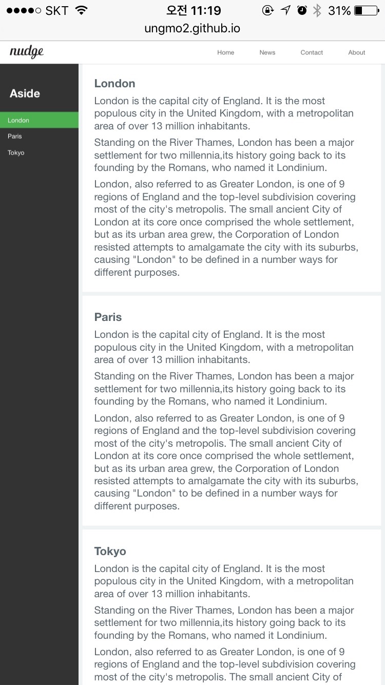
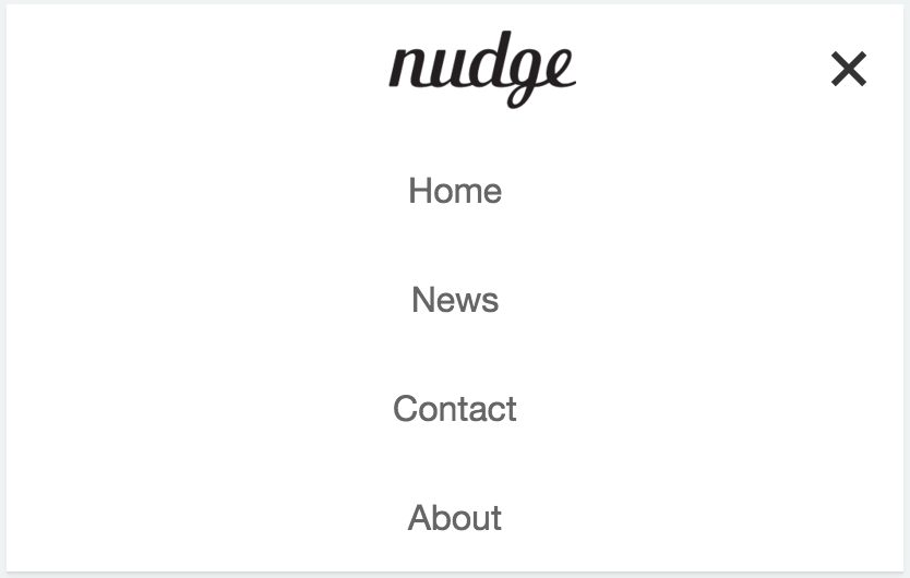
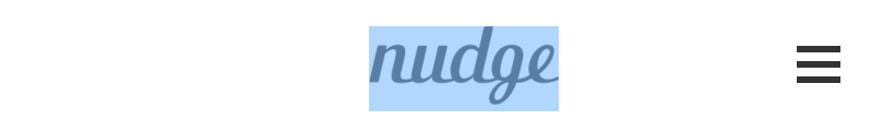
2.2 Responsive Navigation Bar - Smartphone
태블릿 layout에서는 header 영역을 2단으로 분리하여 navigation bar는 header 하단 영역에 배치하였다. 하지만 스마트폰의 viewport width는 가로로 나란히 정렬되어 있는 navigation bar를 모두 담기에는 너무 좁다. 다음과 같이 스마트폰 layout을 정의한다.
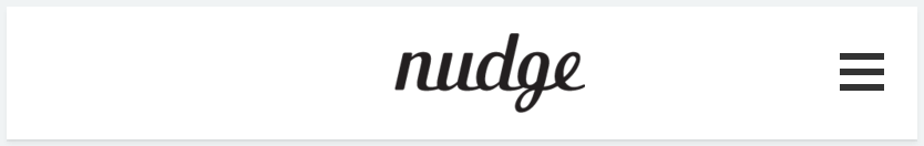
우측 navigation icon을 클릭하면 navigation bar가 수직 정렬되어 화면에 나타나도록 한다. 한번 더 클릭하면 화면에서 사라지도록 한다. 이때 navigation icon에 animation 효과를 부여한다.
nav 요소 내에 클릭할 수 있는 navigation icon을 만들기 위한 html tag를 추가한다. label tag의 for 프로퍼티값과 input tag의 id 프로퍼티값이 일치하여야 한다.
<nav>
  <input class="nav-toggle" id="nav-toggle" type="checkbox">
  <label class="navicon" for="nav-toggle"><span class="navicon-bar"></span></label>
  <ul class="nav-items">
    <li><a href="#home">Home</a></li>
...
위의 코드는 checkbox의 기본 외관을 사용하지 않고 커스텀 navigation icon을 사용하기 위한 방법이다.
<label for="remeber-pw">Remeber password?</label>
<input type="checkbox" name="remeber-pw" id="remeber-pw">
input checkbox 요소의 id 프로퍼티값과 label 요소의 for 프로퍼티값을 일치시켜 연동하면 label 요소를 클릭하여도 input checkbox 요소가 클릭된다.
이것을 이용하여 label 요소의 콘텐츠를 커스텀 navigation icon으로 만들어 주고 input checkbox 요소의 기본 외관을 비표시하는 방법이다.
그럼 navigation icon을 만들어 보자.
navigation icon은 input checkbox 요소와 연동되어야 하므로 label 요소를 사용하였다. 즉, navigation icon을 클릭하면 checkbox input tag도 checked 상태가 된다.
navigation icon의 style은 다음과 같이 정의한다.
.navicon {
  cursor: pointer;
  height: 60px;
  padding: 28px 15px;
  position: absolute;
  top: 0; right: 0;
}
navigation icon은 header 우측의 절대 위치에 배치되어야 하므로 position: absolute;를 지정한다.
absolute 프로퍼티는 부모 요소 또는 가장 가까이 있는 조상 요소(static 제외)를 기준으로 좌표 프로퍼티(top, bottom, left, right)만큼 이동한다. 즉, relative, absolute, fixed 프로퍼티가 선언되어 있는 부모 또는 조상 요소를 기준으로 위치가 결정된다. 만일 부모 또는 조상 요소가 static인 경우, document body를 기준으로 하여 좌표 프로퍼티대로 위치하게 된다.
이 경우, navigation icon은 body를 기준으로 위치하면 되므로 부모 요소에 별도의 처리가 필요없다.
다음은 label tag 내의 span tag의 style을 정의한다. span tag는 navigation icon의 내부 막대 3개(클릭 시에는 X 표시)를 표현하기 위해 정의하였다.
.navicon-bar {
  display: block;
  width: 20px;
  height: 3px;
  background-color: #333;
}

위 그림과 같이 navigation icon의 내부 막대 1개가 표기된다.
가상 요소 선택자 (Pseudo-Element Selector)를 사용하여 navigation icon의 내부 막대 앞뒤 공간에 내부 막대를 추가한다.
.navicon-bar::before,
.navicon-bar::after {
  background-color: #333;
  content: "";
  display: block;
  height: 100%;
  width: 100%;
  position: absolute;
}
.navicon-bar::before {
  top: -7px;
}
.navicon-bar::after {
  top: 7px;
}
절대 위치를 지정하기 위해 position: absolute;를 사용하였으므로 가상 요소의 부모 요소인 span 요소(.navicon-bar)에 position: relative;를 추가한다.
.navicon-bar {
  background-color: #333;
  display: block;
  position: relative;
  width: 20px;
  height: 3px;
}

아직 navigation icon을 클릭하여도 아무런 반응이 없다. navigation icon을 클릭하면 클릭되었음을 사용자가 확인할 수 있도록 navigation icon의 style을 변화시킨다.
input checkbox tag의 가상 클래스 선택자 checked를 이용하여 클릭되었을 때(input:checked)와 그렇지 않을 때를 구분할 수 있다.
.nav-toggle:checked ~ .navicon > .navicon-bar {
  background: transparent;
}
.nav-toggle:checked ~ .navicon > .navicon-bar::before {
  transform: rotate(45deg);
  top: 0;
}
.nav-toggle:checked ~ .navicon > .navicon-bar::after {
  transform: rotate(-45deg);
  top: 0;
}
먼저 중간에 위치한 막대를 없앤다. 그리고 상하 막대를 45도 회전시킨다. 이때 위치가 틀어지므로 top: 0;로 보정한다.

navigation icon에 transition 효과를 부여하여 좀더 부드럽게 움직이도록 한다.
.navicon-bar {
  background-color: #333;
  display: block;
  position: relative;
  transition: background-color .2s ease-out;
  width: 20px;
  height: 3px;
}
.navicon-bar::before,
.navicon-bar::after {
  background-color: #333;
  content: "";
  display: block;
  height: 100%;
  width: 100%;
  position: absolute;
  transition: all .2s ease-out;
}
transition 프로퍼티는 property, duration, delay 순으로 정의한다.
navigation icon을 클릭하면 의도하지 않게 이미지가 선택되는 현상이 발생할 수 있다.
이것은 navigation icon이 텍스트이기 때문에 발생하는 문제이다. 이 문제는 텍스트 선택을 차단하는 방법인 user-select: none; 프로퍼티를 지정하여 회피할 수 있다. user-select 프로퍼티는 현재 W3C(World Wide Web 컨소시엄) CSS 사양에 포함되어 있지 않기 때문에 벤더프리픽스(vendor prefix)를 사용하여야 한다.
.navicon {
  cursor: pointer;
  height: 60px;
  padding: 28px 15px;
  position: absolute;
  top: 0; right: 0;

  -webkit-user-select: none;  /* Chrome all / Safari all */
  -moz-user-select: none;     /* Firefox all */
  -ms-user-select: none;      /* IE 10+ */
  user-select: none;          /* Likely future */
}
navigation icon과 checkbox input tag는 스마트폰 layout 이외의 경우, 화면에 표시되어서는 않된다. 따라서 display: none;으로 화면에 표시되지 않도록 한다. display: none;은 해당 공간조차 점유하지 않지만 visibility: hidden;을 사용하면 해당 공간은 남아있고 표시만 되지 않는다. 참고 : CSS display
CSS 적용 우선 순위 (Cascading Order)를 고려하여 가장 마지막에 정의하는 것이 안전하다. 일반적으로 media query를 가장 마지막에 정의하므로 media query 정의부 직전에 위치시킨다.
.nav-toggle {
  display: none;
}
.navicon {
  display: none;
}
tablet용 layout에서 header height를 2배로 하였으므로 mobile용 layout을 위해 다시 60px로 되돌린다.
@media screen and (max-width: 480px) {
  header {
    height: 60px;
  }
}
스마트폰 layout에서는 navigation bar가 초기상태에서 비표시되어야 한다. 그리고 navigation icon은 표시되어야 한다. 아직 navigation icon을 완성하지 않았으므로 표시되지 않는다.
@media screen and (max-width: 480px) {
  header {
    height: 60px;
  }
  .nav-items {
    display: none;
  }
  .navicon {
    display: block;
  }
}
콘텐츠 영역이 아직 tablet layout에 맞추어 아래로 내려가 있다. header 영역 바로 아래로 다시 끌어 올린다.
@media screen and (max-width: 480px) {
  /*...*/
  #wrap {
    /* margin-top = header height */
    margin-top: 60px;
  }
  aside {
    top: 60px;
  }
  /*...*/
}
마지막으로 navigation icon을 클릭하면 navigation item이 표시되도록 한다.
@media screen and (max-width: 480px) {
  ...

  .nav-toggle:checked ~ .nav-items {
    display: block;
    width: 100%;
    background-color: #fff;
    box-shadow: 0 2px 2px rgba(0, 0, 0, 0.05), 0 1px 0 rgba(0, 0, 0, 0.05);
  }
  .nav-items > li  {
    display: block;
  }
  .nav-items > li > a {
    line-height: 50px;
  }
}
다음은 완성된 Responsive Navigation Bar의 소스코드이다.
<!DOCTYPE html>
<html>
<head>
  <meta charset="UTF-8">
  <meta name="viewport" content="width=device-width, initial-scale=1.0">
  <meta http-equiv="X-UA-Compatible" content="ie=edge">
  <style>
    /* Simple Reset CSS */
    * {
      margin: 0; padding: 0;
      box-sizing: border-box;
    }
    body {
      font-family: "Helvetica Neue", Helvetica, Arial, sans-serif;
      color: #58666e;
      background-color: #f0f3f4;
      -webkit-font-smoothing: antialiased;
      -webkit-text-size-adjus: 100%;  /* iphone font size 변경 방지 */
    }
    li { list-style: none; }
    a { text-decoration: none; }
    h1, h2, h3, h4, h5, h6, p {
      margin: 10px 5px;
    }
    h1 { font-size: 1.8em; }

    #wrap {
      width: 100%;
      /* margin-top = header height */
      margin-top: 60px;
    }

    /* Navigation bar */
    header {
      /* for sticky header */
      position: fixed;
      top: 0;

      width: 100%;
      height: 60px;
      z-index: 2000;
      background-color: #fff;
      box-shadow: 0 2px 2px rgba(0, 0, 0, 0.05), 0 1px 0 rgba(0, 0, 0, 0.05);
    }
    .logo {
      display: inline-block;
      height: 36px;
      margin: 12px 0 12px 25px;
    }
    .logo > img { height: 36px; }
    nav {
      float: right;
    }
    .nav-items {
      margin-right: 20px;
    }
    .nav-items > li {
      display: inline-block; /* 가로정렬 */
    }
    .nav-items > li > a {
      line-height: 60px; /* for Vertical Centering */
      padding: 0 30px;   /* nav item간 간격 */
      color: rgba(0,0,0,0.4);
    }
    .nav-items > li > a:hover {
      color: rgba(0,0,0,0.8);
    }

    /* navigation icon for Mobile Layout */
    .navicon {
      cursor: pointer;
      height: 60px;
      padding: 28px 15px;
      position: absolute;
      top: 0; right: 0;

      -webkit-user-select: none;  /* Chrome all / Safari all */
      -moz-user-select: none;     /* Firefox all */
      -ms-user-select: none;      /* IE 10+ */
      user-select: none;          /* Likely future */
    }
    /* nav icon의 내부 막대 */
    .navicon-bar {
      background-color: #333;
      display: block;
      position: relative;
      /* navigation icon animation */
      transition: background-color .2s ease-out;
      width: 20px;
      height: 3px;
    }
    .navicon-bar::before,
    .navicon-bar::after {
      background-color: #333;
      content: "";
      display: block;
      height: 100%;
      width: 100%;
      position: absolute;
      /* navigation icon animation */
      transition: all .2s ease-out;
    }
    .navicon-bar::before {
      top: -7px;
    }
    .navicon-bar::after {
      top: 7px;
    }
    /* toggle navigation icon */
    .nav-toggle:checked ~ .navicon > .navicon-bar {
      background: transparent;
    }
    .nav-toggle:checked ~ .navicon > .navicon-bar::before {
      transform: rotate(45deg);
      top: 0;
    }
    .nav-toggle:checked ~ .navicon > .navicon-bar::after {
      transform: rotate(-45deg);
      top: 0;
    }

    /* contents */
    /* clearfix */
    #content-wrap:after {
      content: "";
      display: block;
      clear: both;
    }
    aside {
      /* for fixed side bar */
      position: fixed;
      top: 60px;
      bottom: 0;

      width: 200px;  /* 너비 고정 */
      padding-top: 25px;
      background-color: #333;
    }
    /* aside navigation */
    aside > ul {
      width: 200px;
    }
    aside > ul > li > a {
      display: block;
      color: #fff;
      padding: 10px 0 10px 20px;
    }
    aside > ul > li > a.active {
      background-color: #4CAF50;
    }
    aside > ul > li > a:hover:not(.active) {
      background-color: #555;
    }
    aside > h1 {
      padding: 20px 0 20px 20px;
      color: #fff;
    }
    /* Section */
    section {
      float: right;
      margin-left: 200px;  /*aside width*/
    }
    article {
      margin: 10px;
      padding: 25px;
      background-color: white;
    }
    /* footer */
    footer {
      /* footer를 aside위에 올리기 위해 사용(부유객체) */
      position: absolute;
      left: 0;
      bottom: 0;
      width: 100%;
      height: 60px;
      padding: 0 25px;
      line-height: 60px;
      color: #8a8c8f;
      border-top: 1px solid #dee5e7;
      background-color: #f2f2f2;
    }

    .nav-toggle {
      display: none;
    }
    .navicon {
      display: none;
    }

    /* Media Query */
    /* for tablet: ~ 800px */
    @media screen and (max-width: 800px) {
      header {
        height: 120px;
        text-align: center;
      }
      nav {
        float: none;
        margin-right: 0;
      }
      #wrap {
        /* margin-top = header height */
        margin-top: 120px;
      }
      aside {
        top: 120px;
      }
    }
    /* for smartphone: ~ 480px */
    @media screen and (max-width: 480px) {
      header {
        height: 60px;
      }
      .nav-items {
        display: none;
      }
      .navicon {
        display: block;
      }
      #wrap {
        /* margin-top = header height */
        margin-top: 60px;
      }
      aside {
        top: 60px;
      }
      /* View navigation item */
      .nav-toggle:checked ~ .nav-items {
        display: block;
        width: 100%;
        background-color: #fff;
        box-shadow: 0 2px 2px rgba(0, 0, 0, 0.05), 0 1px 0 rgba(0, 0, 0, 0.05);
      }
      .nav-items > li  {
        display: block;
      }
      .nav-items > li > a {
        line-height: 50px;
      }
    }
  </style>
</head>
<body>
  <div id="wrap">
    <header>
      <a class="logo" href="#home"><img src="https://poiemaweb.com/img/logo.png"></a>
      <nav>
        <input class="nav-toggle" id="nav-toggle" type="checkbox">
        <label class="navicon" for="nav-toggle"><span class="navicon-bar"></span></label>
        <ul class="nav-items">
          <li><a href="#home">Home</a></li>
          <li><a href="#news">News</a></li>
          <li><a href="#contact">Contact</a></li>
          <li><a href="#about">About</a></li>
        </ul>
      </nav>
    </header>

    <div id="content-wrap">
      <aside>
        <h1>Aside</h1>
        <ul>
          <li><a href="#" class="active">London</a></li>
          <li><a href="#">Paris</a></li>
          <li><a href="#">Tokyo</a></li>
          <li><a href="#">Newyork</a></li>
        </ul>
      </aside>
      <section>
        <article id="london">
          <h1>London</h1>
          <p>London is the capital city of England. It is the most populous city in the United Kingdom, with a metropolitan area of over 13 million inhabitants.</p>
          <p>Standing on the River Thames, London has been a major settlement for two millennia,its history going back to its founding by the Romans, who named it Londinium.</p>
          <p>London, also referred to as Greater London, is one of 9 regions of England and the top-level subdivision covering most of the city's metropolis. The small ancient City of London at its core once comprised the whole settlement, but as its urban area grew, the Corporation of London resisted attempts to amalgamate the city with its suburbs, causing "London" to be defined in a number ways for different purposes.</p>
        </article>
        <article id="paris">
          <h1>Paris</h1>
          <p>London is the capital city of England. It is the most populous city in the United Kingdom, with a metropolitan area of over 13 million inhabitants.</p>
          <p>Standing on the River Thames, London has been a major settlement for two millennia,its history going back to its founding by the Romans, who named it Londinium.</p>
          <p>London, also referred to as Greater London, is one of 9 regions of England and the top-level subdivision covering most of the city's metropolis. The small ancient City of London at its core once comprised the whole settlement, but as its urban area grew, the Corporation of London resisted attempts to amalgamate the city with its suburbs, causing "London" to be defined in a number ways for different purposes.</p>
        </article>
        <article id="tokyo">
          <h1>Tokyo</h1>
          <p>London is the capital city of England. It is the most populous city in the United Kingdom, with a metropolitan area of over 13 million inhabitants.</p>
          <p>Standing on the River Thames, London has been a major settlement for two millennia,its history going back to its founding by the Romans, who named it Londinium.</p>
          <p>London, also referred to as Greater London, is one of 9 regions of England and the top-level subdivision covering most of the city's metropolis. The small ancient City of London at its core once comprised the whole settlement, but as its urban area grew, the Corporation of London resisted attempts to amalgamate the city with its suburbs, causing "London" to be defined in a number ways for different purposes.</p>
        </article>
        <article id="newyork">
          <h1>Newyork</h1>
          <p>London is the capital city of England. It is the most populous city in the United Kingdom, with a metropolitan area of over 13 million inhabitants.</p>
          <p>Standing on the River Thames, London has been a major settlement for two millennia,its history going back to its founding by the Romans, who named it Londinium.</p>
          <p>London, also referred to as Greater London, is one of 9 regions of England and the top-level subdivision covering most of the city's metropolis. The small ancient City of London at its core once comprised the whole settlement, but as its urban area grew, the Corporation of London resisted attempts to amalgamate the city with its suburbs, causing "London" to be defined in a number ways for different purposes.</p>
        </article>
      </section>
      <!-- end of content-wrap -->
    </div>
    <footer>© Copyright 2016 ungmo2</footer>
  <!-- end of wrap   -->
  </div>
</body>
</html>
3. Section & Aside & Footer
현재 article은 layout에 상관없이 1행에 1개씩 배치되었다. responsive web design의 효과를 좀더 체감하기 위하여 1행에 2열로 배치한다.
article을 2열로 배치하기 위해서 width 값을 지정하여야 한다. %로 width 값을 지정하여 viewport에 상대적인 너비를 갖도록 한다. 이때 margin도 %로 지정한다. 그리고 float: left;를 지정하여 2열로 정렬되도록 한다.
article {
  width: 48.5%;
  margin: 1%;
  padding: 25px;
  background-color: white;
  float: left;
}
짝수번째 배치되는 article의 좌측 마진과 3번째부터 등장하는 article의 위측 마진을 0로 하여 가운데 마진이 2배가 되는 것을 방지한다.
article:nth-of-type(2n) {
  margin-left: 0;
}
article:nth-of-type(n+3) {
  margin-top: 0;
}
tablet layout을 작성한다. 800px 이하로 화면이 작아지면 2열 배치되어 있던 article을 1열로 배치한다.
@media screen and (max-width: 800px) {
  ...
  article {
    width: inherit;
    display: block;
    margin: 10px;
    float: none;
  }
  article:nth-of-type(2n) {
    margin: 10px;
  }
  article:nth-of-type(n+2) {
    margin-top: 0;
  }
}
mobile layout을 작성한다. 480px 이하로 화면이 작아지면 고정 배치되어 있던 aside를 article 위로 올려 배치한다.
@media screen and (max-width: 480px) {
  /*...*/
  aside {
    top: 60px;
    position: static;
    width: 100%;
    padding: 5px 0;
  }
  /* aside navigation */
  aside > ul {
    width: 100%;
  }
  aside > h1 {
    padding: 5px 0 10px 20px;
    color: #fff;
  }
  section {
    float: none;
    margin-left: 0;
  }
  /*...*/
}
완성된 코드는 아래와 같다.
<!DOCTYPE html>
<html>
  <head>
    <meta charset="UTF-8">
    <meta name="viewport" content="width=device-width, initial-scale=1.0">
    <meta http-equiv="X-UA-Compatible" content="ie=edge">
    <style>
      /* Simple Reset CSS */
      * {
        margin: 0; padding: 0;
        box-sizing: border-box;
      }
      body {
        font-family: "Helvetica Neue", Helvetica, Arial, sans-serif;
        color: #58666e;
        background-color: #f0f3f4;
        -webkit-font-smoothing: antialiased;
        -webkit-text-size-adjus: 100%;  /* iphone font size 변경 방지 */
      }
      li { list-style: none; }
      a { text-decoration: none; }
      h1, h2, h3, h4, h5, h6, p {
        margin: 10px 5px;
      }
      h1 { font-size: 1.8em; }

      #wrap {
        width: 100%;
        /* margin-top = header height */
        margin-top: 60px;
      }

      /* Navigation bar */
      header {
        /* for sticky header */
        position: fixed;
        top: 0;

        width: 100%;
        height: 60px;
        z-index: 2000;
        background-color: #fff;
        box-shadow: 0 2px 2px rgba(0, 0, 0, 0.05), 0 1px 0 rgba(0, 0, 0, 0.05);
      }
      .logo {
        display: inline-block;
        height: 36px;
        margin: 12px 0 12px 25px;
      }
      .logo > img { height: 36px; }
      nav {
        float: right;
      }
      .nav-items {
        margin-right: 20px;
      }
      .nav-items > li {
        display: inline-block; /* 가로정렬 */
      }
      .nav-items > li > a {
        line-height: 60px; /* for Vertical Centering */
        padding: 0 30px;   /* nav item간 간격 */
        color: rgba(0,0,0,0.4);
      }
      .nav-items > li > a:hover {
        color: rgba(0,0,0,0.8);
      }

      /* navigation icon for Mobile Layout */
      .navicon {
        cursor: pointer;
        height: 60px;
        padding: 28px 15px;
        position: absolute;
        top: 0; right: 0;

        -webkit-user-select: none;  /* Chrome all / Safari all */
        -moz-user-select: none;     /* Firefox all */
        -ms-user-select: none;      /* IE 10+ */
        user-select: none;          /* Likely future */
      }
      /* nav icon의 내부 막대 */
      .navicon-bar {
        background-color: #333;
        display: block;
        position: relative;
        /* navigation icon animation */
        transition: background-color .2s ease-out;
        width: 20px;
        height: 3px;
      }
      .navicon-bar::before,
      .navicon-bar::after {
        background-color: #333;
        content: "";
        display: block;
        height: 100%;
        position: absolute;
        /* navigation icon animation */
        transition: all .2s ease-out;
        width: 100%;
      }
      .navicon-bar::before {
        top: -7px;
      }
      .navicon-bar::after {
        top: 7px;
      }
      /* toggle navigation icon */
      .nav-toggle:checked ~ .navicon > .navicon-bar {
        background: transparent;
      }
      .nav-toggle:checked ~ .navicon > .navicon-bar::before {
        transform: rotate(45deg);
        top: 0;
      }
      .nav-toggle:checked ~ .navicon > .navicon-bar::after {
        transform: rotate(-45deg);
        top: 0;
      }

      /* contents */
      /* clearfix */
      #content-wrap:after {
        content: "";
        display: block;
        clear: both;
      }
      aside {
        /* for fixed side bar */
        position: fixed;
        top: 60px;
        bottom: 0;

        width: 200px;  /* 너비 고정 */
        padding-top: 25px;
        background-color: #333;
      }
      /* aside navigation */
      aside > ul {
        width: 200px;
      }
      aside > ul > li > a {
        display: block;
        color: #fff;
        padding: 10px 0 10px 20px;
      }
      aside > ul > li > a.active {
        background-color: #4CAF50;
      }
      aside > ul > li > a:hover:not(.active) {
        background-color: #555;
      }
      aside > h1 {
        padding: 20px 0 20px 20px;
        color: #fff;
      }
      /* Section */
      section {
        float: right;
        margin-left: 200px;  /*aside width*/
      }
      article {
        width: 48.5%;
        margin: 1%;
        padding: 25px;
        background-color: white;
        float: left;
      }
      article:nth-of-type(2n) {
        margin-left: 0;
      }
      article:nth-of-type(n+3) {
        margin-top: 0;
      }
      /* footer */
      footer {
        /* footer를 aside위에 올리기 위해 사용(부유객체) */
        position: absolute;
        height: 60px;
        width: 100%;
        padding: 0 25px;
        line-height: 60px;
        color: #8a8c8f;
        border-top: 1px solid #dee5e7;
        background-color: #f2f2f2;
      }

      .nav-toggle {
        display: none;
      }
      .navicon {
        display: none;
      }

      /* Media Query */
      /* for tablet: ~ 800px */
      @media screen and (max-width: 800px) {
        header {
          height: 120px;
          text-align: center;
        }
        nav {
          float: none;
          margin-right: 0;
        }
        #wrap {
          /* margin-top = header height */
          margin-top: 120px;
        }
        aside {
          top: 120px;
        }

        article {
          width: inherit;
          display: block;
          margin: 10px;
          float: none;
        }
        article:nth-of-type(2n) {
          margin: 10px;
        }
        article:nth-of-type(n+2) {
          margin-top: 0;
        }
      }
      /* for smartphone: ~ 480px */
      @media screen and (max-width: 480px) {
        header {
          height: 60px;
        }
        .nav-items {
          display: none;
        }
        .navicon {
          display: block;
        }
        #wrap {
          /* margin-top = header height */
          margin-top: 60px;
        }
        aside {
          top: 60px;
          position: static;
          width: 100%;
          padding: 5px 0;
        }
        /* aside navigation */
        aside > ul {
          width: 100%;
        }
        aside > h1 {
          padding: 5px 0 10px 20px;
          color: #fff;
        }
        section {
          float: none;
          margin-left: 0;
        }
        /* View navigation item */
        .nav-toggle:checked ~ .nav-items {
          display: block;
          width: 100%;
          background-color: #fff;
          box-shadow: 0 2px 2px rgba(0, 0, 0, 0.05), 0 1px 0 rgba(0, 0, 0, 0.05);
        }
        .nav-items > li  {
          display: block;
        }
        .nav-items > li > a {
          line-height: 50px;
        }
      }
    </style>
  </head>
  <body>
    <div id="wrap">
      <header>
        <a class="logo" href="#home"><img src="https://poiemaweb.com/img/logo.png"></a>
        <nav>
          <input class="nav-toggle" id="nav-toggle" type="checkbox">
          <label class="navicon" for="nav-toggle"><span class="navicon-bar"></span></label>
          <ul class="nav-items">
            <li><a href="#home">Home</a></li>
            <li><a href="#news">News</a></li>
            <li><a href="#contact">Contact</a></li>
            <li><a href="#about">About</a></li>
          </ul>
        </nav>
      </header>

      <div id="content-wrap">
        <aside>
          <h1>Aside</h1>
          <ul>
            <li><a href="#" class="active">London</a></li>
            <li><a href="#">Paris</a></li>
            <li><a href="#">Tokyo</a></li>
            <li><a href="#">Newyork</a></li>
          </ul>
        </aside>
        <section>
          <article id="london">
            <h1>London</h1>
            <p>London is the capital city of England. It is the most populous city in the United Kingdom, with a metropolitan area of over 13 million inhabitants.</p>
            <p>Standing on the River Thames, London has been a major settlement for two millennia,its history going back to its founding by the Romans, who named it Londinium.</p>
            <p>London, also referred to as Greater London, is one of 9 regions of England and the top-level subdivision covering most of the city's metropolis. The small ancient City of London at its core once comprised the whole settlement, but as its urban area grew, the Corporation of London resisted attempts to amalgamate the city with its suburbs, causing "London" to be defined in a number ways for different purposes.</p>
          </article>
          <article id="paris">
            <h1>Paris</h1>
            <p>London is the capital city of England. It is the most populous city in the United Kingdom, with a metropolitan area of over 13 million inhabitants.</p>
            <p>Standing on the River Thames, London has been a major settlement for two millennia,its history going back to its founding by the Romans, who named it Londinium.</p>
            <p>London, also referred to as Greater London, is one of 9 regions of England and the top-level subdivision covering most of the city's metropolis. The small ancient City of London at its core once comprised the whole settlement, but as its urban area grew, the Corporation of London resisted attempts to amalgamate the city with its suburbs, causing "London" to be defined in a number ways for different purposes.</p>
          </article>
          <article id="tokyo">
            <h1>Tokyo</h1>
            <p>London is the capital city of England. It is the most populous city in the United Kingdom, with a metropolitan area of over 13 million inhabitants.</p>
            <p>Standing on the River Thames, London has been a major settlement for two millennia,its history going back to its founding by the Romans, who named it Londinium.</p>
            <p>London, also referred to as Greater London, is one of 9 regions of England and the top-level subdivision covering most of the city's metropolis. The small ancient City of London at its core once comprised the whole settlement, but as its urban area grew, the Corporation of London resisted attempts to amalgamate the city with its suburbs, causing "London" to be defined in a number ways for different purposes.</p>
          </article>
          <article id="newyork">
            <h1>Newyork</h1>
            <p>London is the capital city of England. It is the most populous city in the United Kingdom, with a metropolitan area of over 13 million inhabitants.</p>
            <p>Standing on the River Thames, London has been a major settlement for two millennia,its history going back to its founding by the Romans, who named it Londinium.</p>
            <p>London, also referred to as Greater London, is one of 9 regions of England and the top-level subdivision covering most of the city's metropolis. The small ancient City of London at its core once comprised the whole settlement, but as its urban area grew, the Corporation of London resisted attempts to amalgamate the city with its suburbs, causing "London" to be defined in a number ways for different purposes.</p>
          </article>
        </section>
        <!-- end of content-wrap -->
      </div>
      <footer>© Copyright 2016 ungmo2</footer>
    <!-- end of wrap   -->
    </div>
  </body>
</html>