
이 포스트는 Scotch.io : A Visual Guide to CSS3 Flexbox Properties를 바탕으로 작성되었다.
1. Introduction
Flexbox는 모던 웹을 위하여 제안된 기존 layout보다 더 세련된 방식의 니즈에 부합하기 위한 CSS3의 새로운 layout 방식이다.
요소의 사이즈가 불명확하거나 동적으로 변화할 때에도 유연한 레이아웃을 실현할 수 있다. 복잡한 레이아웃이라도 적은 코드로 보다 간단하게 표현할 수 있다.
이해를 돕기 위해 간단한 flexbox 레이아웃을 만들어 보자.
<!DOCTYPE html>
<html>
<head>
  <meta charset="UTF-8">
  <title>Flexbox Layout Example</title>
  <style>
    .flex-container {
      margin: 10px;
      padding: 15px;
      border-radius: 5px;
      background: #60B99A;
    }

    .flex-item {
      margin: 10px;
      padding: 20px;
      color: #fff;
      text-align: center;
      border-radius: 5px;
      background: #4584b1;
    }
  </style>
</head>
<body>
  <div class="flex-container">
    <div class="flex-item">1</div>
    <div class="flex-item">2</div>
    <div class="flex-item">3</div>
    <div class="flex-item">4</div>
    <div class="flex-item">5</div>
  </div>
</body>
</html>
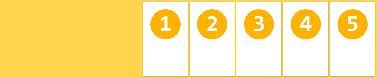
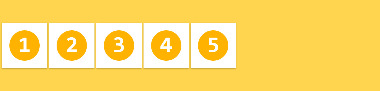
위 코드를 실행 결과는 아래와 같다.
See the Pen Flexbox layout example-before by Ungmo Lee (@ungmo2) on CodePen.
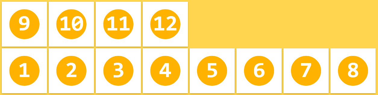
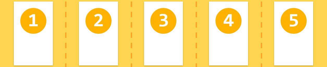
div 요소는 block 요소이므로 수직 정렬된다. 이를 수평 정렬하려면 자식요소(flex-item)를 inline-block으로 지정하거나 float 프로퍼티를 지정한다.
.flex-item {
  display: inline-block;
  /* or */
  float: left;
}
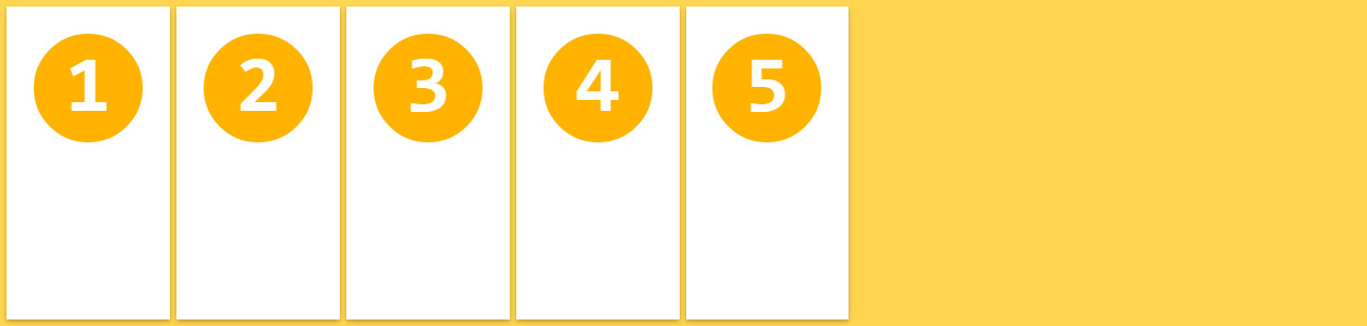
이때 각 자식 요소을 부모 요소 내에서 정렬하기 위해서는 각 자식 요소의 너비를 %로 지정하는 등 번거로운 처리가 필요하다. 자식 요소의 사이즈가 불명확하거나 동적으로 변화할 때에는 더욱 처리가 복잡해 진다. grid 시스템을 사용할 수 도 있으나 이 또한 새로운 학습이 필요하고 라이브러리를 로드해야하는 번거로움이 존재한다.
Flexbox를 사용하여 위 예제를 부모 요소 내에서 균등 수평 정렬해 보자. 부모 요소에 아래와 같이 2행을 추가하면 된다.
.flex-container {
  display: flex;
  justify-content: space-around;
}
Flexbox를 사용하면 기존에 방식에 비해 매우 간단히 레이아웃을 처리할 수 있다. 그 결과는 아래와 같다.
See the Pen Flexbox layout example by Ungmo Lee (@ungmo2) on CodePen.
Flexbox의 장점을 정리해 보면 아래와 같다.
- 1줄의 코드 추가로 수평 정렬이 가능하다.
- 요소의 상하좌우 정렬, 순서 변경이 간단하다.
- 요소가 간격 조절이 간단하다.
- 서로 다른 height를 갖는 요소의 수평정렬 시, 간단히 상하중앙 정렬이 가능하다.
비교적 최신 브라우저가 아니면 벤더 프리픽스를 사용하여야 하고 IE계열은 IE8,9의 경우 지원하지 않고 IE10,11의 경우도 일부 지원하므로 주의가 필요하다. IE계열에서 Flexbox를 사용하기 위해서는 flexibility.js를 사용하면 편리하다.
브라우저의 지원 상황은 caniuse를 참조하기 바란다.
2. Usage
Flexbox 레이아웃은 flex item이라 불리는 복수의 자식 요소와 이들을 내포하는 flex-container 부모 요소로 구성된다.
flexbox를 사용하기 위해서 HTML 부모 요소의 display 속성에 flex를 지정한다.
.flex-container {
  display: flex;
}
부모 요소가 inline 요소인 경우 inline-flex을 지정한다.
.flex-container {
  display: inline-flex;
}
flex 또는 inline-flex는 부모 요소에 반드시 지정해야하는 유일한 속성이며 자식 요소는 자동적으로 flex item이 된다.
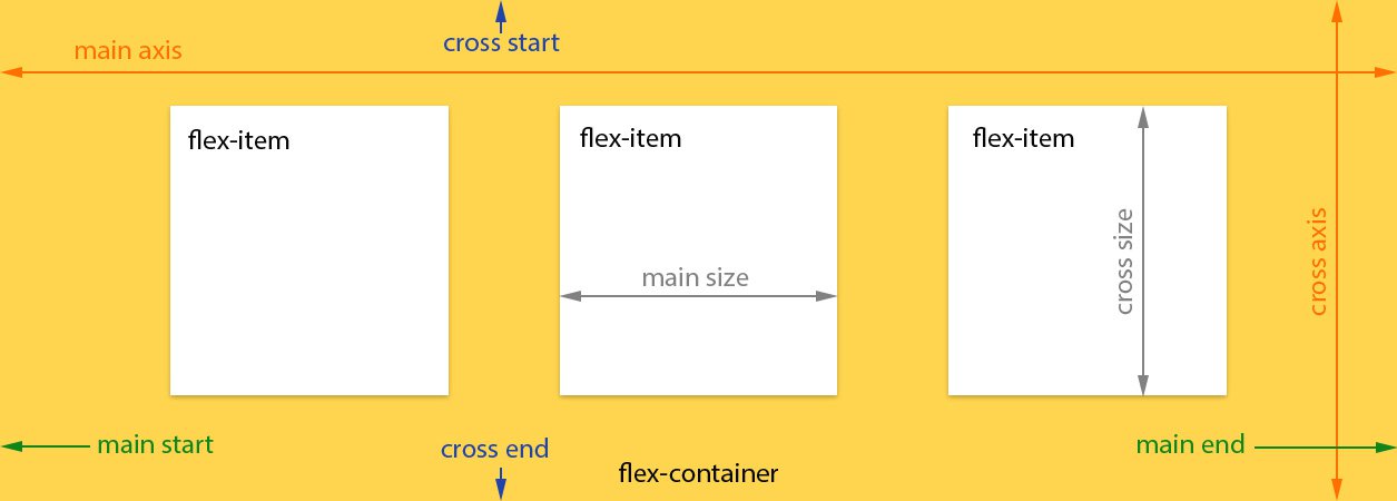
3. Flexbox container 속성
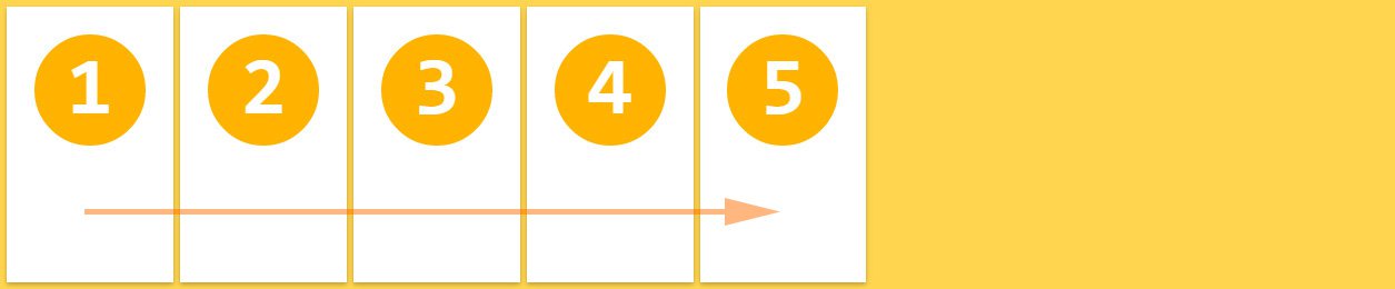
3.1 flex-direction
flex-direction 속성은 flex 컨테이너의 주축(main axis) 방향을 설정한다.
flex-direction: row;
좌에서 우로(ltr) 수평 배치된다. flex-direction 속성의 기본값이다.
.flex-container {
  flex-direction: row;
}
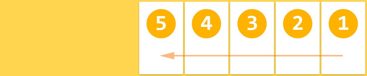
flex-direction: row-reverse;
우에서 좌로(rtl) 수평 배치된다.
.flex-container {
  flex-direction: row-reverse;
}
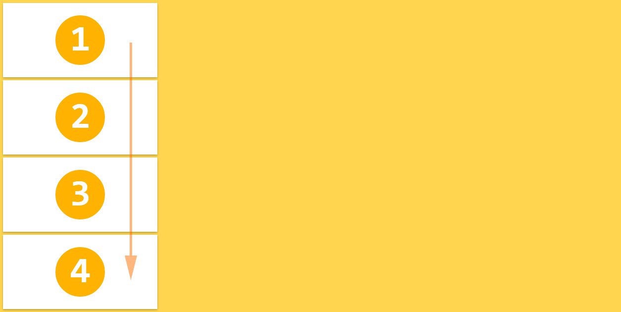
flex-direction: column;
위에서 아래로 수직 배치된다.
.flex-container {
  flex-direction: column;
}
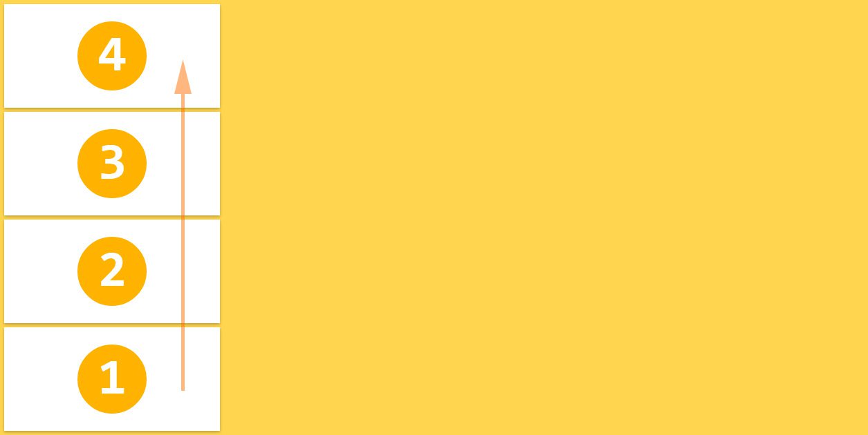
flex-direction: column-reverse;
아래에서 위로 수직 배치된다.
.flex-container {
  flex-direction: column-reverse;
}
3.2 flex-wrap
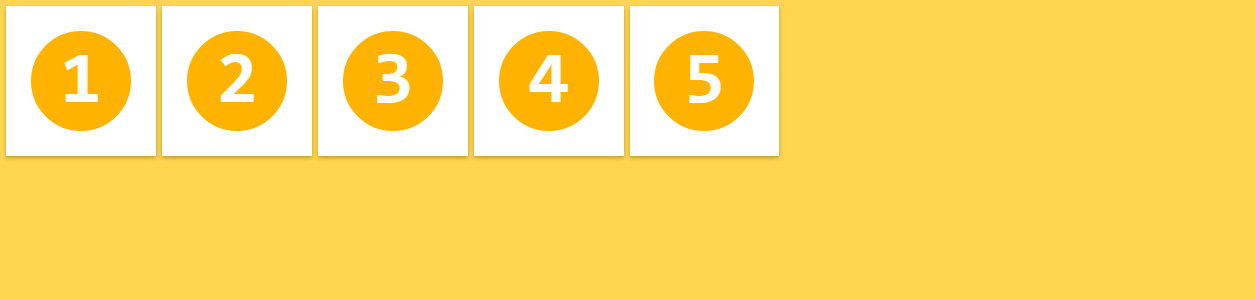
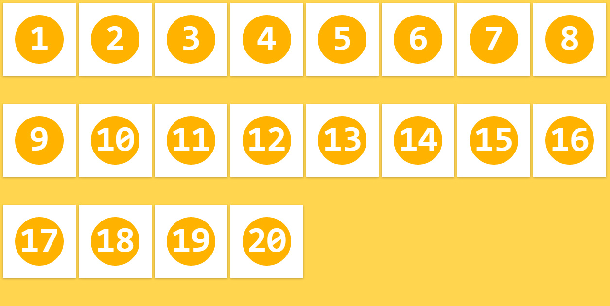
flex-wrap 속성은 flex 컨테이너의 복수 flex item을 1행으로 또는 복수행으로 배치한다. flex-wrap 속성은 flex 컨테이너의 width보다 flex item들의 width의 합계가 더 큰 경우, 한줄로 표현할 것인지, 여러줄로 표현할 것인지를 지정한다.
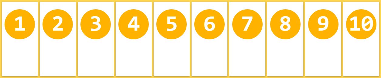
flex-wrap: nowrap;
flex item을 개행하지 않고 1행에 배치한다. flex-wrap 속성의 기본값이다.
각 flex item의 폭은 flex container에 들어갈 수 있는 크기로 축소된다.
.flex-container {
  flex-wrap: nowrap;
}
<!DOCTYPE html>
<html>
<head>
  <title>Flexbox</title>
  <meta charset="UTF-8">
  <style>
  .flex-container {
    width: 500px;
    margin: 10px;
    padding: 15px;
    border-radius: 5px;
    background: #60B99A;

    display: flex;
    flex-wrap: nowrap;
  }

  .flex-item {
    margin: 10px;
    padding: 20px;
    color: #fff;
    text-align: center;
    border-radius: 5px;
    background: #4584b1;
  }
  </style>
</head>
<body>
  <div class="flex-container">
    <div class="flex-item">11111</div>
    <div class="flex-item">22222</div>
    <div class="flex-item">33333</div>
    <div class="flex-item">44444</div>
    <div class="flex-item">55555</div>
  </div>
</body>
</html>
하지만 flex item들의 width의 합계가 flex 컨테이너의 width보다 큰 경우 flex 컨테이너를 넘치게 된다. 이때 overflow: auto;를 지정하면 가로 스크롤이 생기며 컨테이너를 넘치지 않는다.
<!DOCTYPE html>
<html>
<head>
  <title>Flexbox</title>
  <meta charset="UTF-8">
  <style>
  .flex-container {
    width: 500px;
    margin: 10px;
    padding: 15px;
    border-radius: 5px;
    background: #60B99A;

    display: flex;
    flex-wrap: nowrap;
    overflow: auto;
  }

  .flex-item {
    margin: 10px;
    padding: 20px;
    color: #fff;
    text-align: center;
    border-radius: 5px;
    background: #4584b1;
  }
  </style>
</head>
<body>
  <div class="flex-container">
    <div class="flex-item">11111111</div>
    <div class="flex-item">22222222</div>
    <div class="flex-item">33333333</div>
    <div class="flex-item">44444444</div>
    <div class="flex-item">55555555</div>
  </div>
</body>
</html>
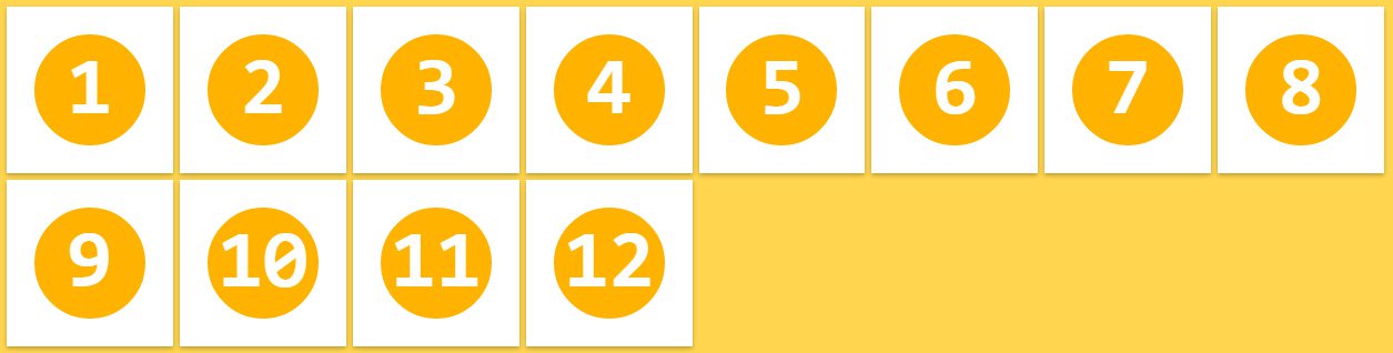
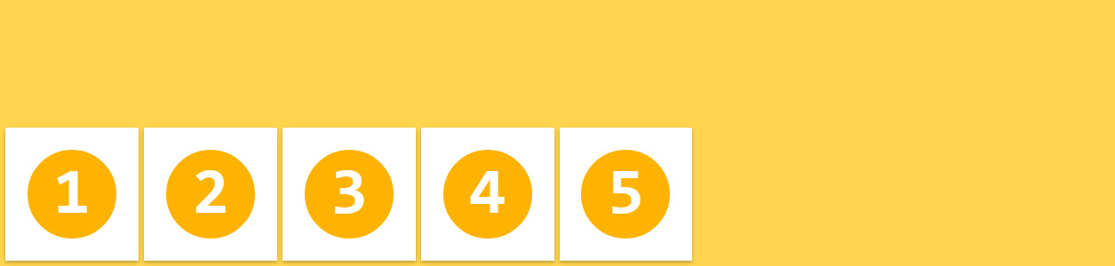
flex-wrap: wrap;
flex item들의 width의 합계가 flex 컨테이너의 width보다 큰 경우, flex item을 복수행에 배치한다. 기본적으로 좌에서 우로, 위에서 아래로 배치된다.
.flex-container {
  flex-wrap: wrap;
}
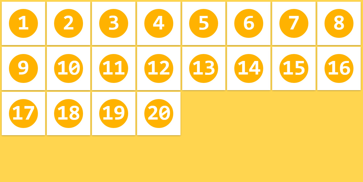
flex-wrap: wrap-reverse;
flex-wrap: wrap;과 동일하나 아래에서 위로 배치된다.
.flex-container {
  flex-wrap: wrap-reverse;
}
3.3 flex-flow
flex-flow 속성은 flex-direction 속성과 flex-wrap 속성을 설정하기 위한 shorthand이다. 기본값은 row nowrap이다.
.flex-container {
  flex-flow: <flex-direction> || <flex-wrap>;
}
3.4 justify-content
flex container의 main axis를 기준으로 flex item을 수평 정렬한다.
justify-content: flex-start;
main start(좌측)를 기준으로 정렬한다. justify-content 속성의 기본값이다.
.flex-container {
  justify-content: flex-start;
}

justify-content: flex-end;
main end(우측)를 기준으로 정렬한다.
.flex-container {
  justify-content: flex-end;
}
justify-content: center;
flex container의 중앙에 정렬한다.
.flex-container {
  justify-content: center;
}
justify-content: space-between;
첫번째와 마지막 flex item은 좌우 측면에 정렬되고 나머지와 균등한 간격으로 정렬된다.
.flex-container {
  justify-content: space-between;
}
justify-content: space-around;
모든 flex item은 균등한 간격으로 정렬된다.
.flex-container {
  justify-content: space-around;
}
3.5 align-items
flex item을 flex container의 수직 방향(cross axis)으로 정렬한다. align-items 속성은 모든 flex item에 적용된다.
align-items: stretch;
모든 flex item은 flex container의 높이(cross start에서 cross end까지의 높이)에 꽉찬 높이를 갖는다. align-items 속성의 기본값이다.
.flex-container {
  align-items: stretch;
}
align-items: flex-start;
모든 flex item은 flex container의 cross start 기준으로 정렬된다.
.flex-container {
  align-items: flex-start;
}
align-items: flex-end;
모든 flex item은 flex container의 cross end 기준으로 정렬된다.
.flex-container {
  align-items: flex-end;
}
align-items: center;
모든 flex item은 flex container의 cross axis의 중앙에 정렬된다.
.flex-container {
  align-items: center;
}
align-items: baseline;
모든 flex item은 flex container의 baseline을 기준으로 정렬된다.
.flex-container {
  align-items: baseline;
}
3.6 align-content
flex container의 cross axis를 기준으로 flex item을 수직 정렬한다.
참고로 justify-content 속성은 flex container의 main axis를 기준으로 flex item을 수평 정렬한다.
align-content: stretch;
모든 flex item은 flex item의 행 이후에 균등하게 분배된 공간에 정렬되어 배치된다. align-content 속성의 기본값이다.
.flex-container {
  align-content: stretch;
}
align-content: flex-start;
모든 flex item은 flex container의 cross start 기준으로 stack 정렬된다.
.flex-container {
  align-content: flex-start;
}
align-content: flex-end;
모든 flex item은 flex container의 cross end 기준으로 stack 정렬된다.
.flex-container {
  align-content: flex-end;
}
align-content: center;
모든 flex item은 flex container의 cross axis의 중앙에 stack 정렬된다.
.flex-container {
  align-content: center;
}
align-content: space-between;
첫번째 flex item의 행은 flex container의 상단에 마지막 flex item의 행은 flex container의 하단에 배치되며 나머지 행은 균등 분할된 공간에 배치 정렬된다.
.flex-container {
  align-content: space-between;
}
align-content: space-around;
모든 flex item은 균등 분할된 공간 내에 배치 정렬된다.
.flex-container {
  align-content: space-around;
}
4. Flexbox item 속성
float, clear, vertical-align 속성은 flex item에 영향을 주지 않는다.
4.1 order
flex item의 배치 순서를 지정한다. HTML 코드를 변경하지 않고 order 속성값을 지정하는 것으로 간단히 재배치할 수 있다. 기본 배치 순서는 flex container에 추가된 순서이다. 기본값은 0이다.
.flex-item {
  order: 정수값;
}

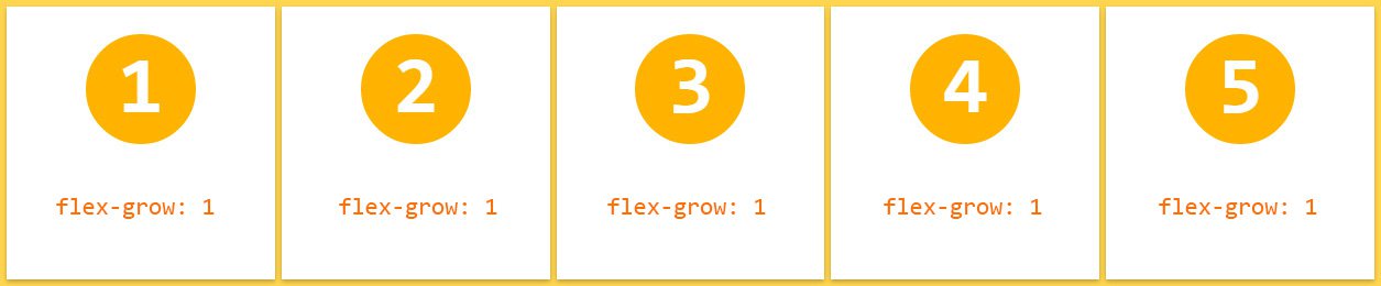
4.2 flex-grow
flex item의 너비에 대한 확대 인자(flex grow factor)를 지정한다. 기본값은 0이고 음수값은 무효하다.
.flex-item {
  flex-grow: 양의 정수값;
}
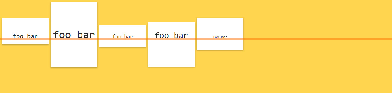
모든 flex item이 동일한 flex-grow 속성값을 가지면 모든 flex item은 동일한 너비를 갖는다.
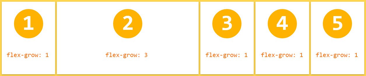
두번째 flex item의 flex-grow 속성값을 3으로 지정하면 다른 flex item보다 더 넓은 너비를 갖는다.
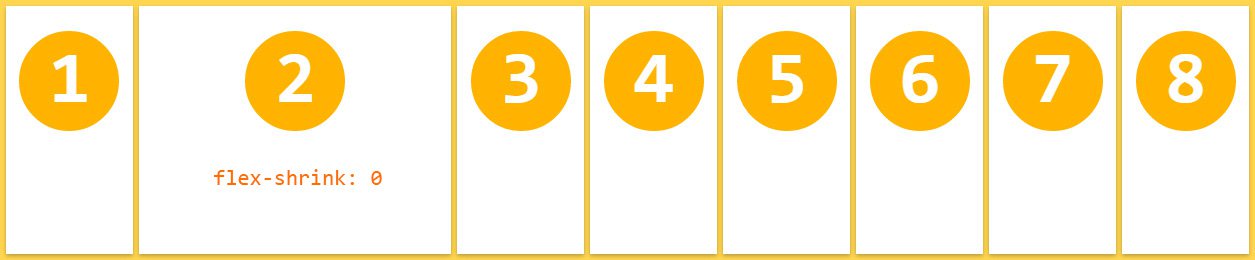
4.3 flex-shrink
flex item의 너비에 대한 축소 인자(flex shrink factor)를 지정한다. 기본값은 1이고 음수값은 무효하다. 0을 지정하면 축소가 해제되어 원래의 너비를 유지한다.
.flex-item {
  flex-shrink: 양의 정수값;
}
기본적으로 모든 flex item은 축소된 상태로 지정(기본값 1)하고 두번째 flex item만 축소를 해제(flex-shrink: 0;)하면 원래의 너비를 유지한다.
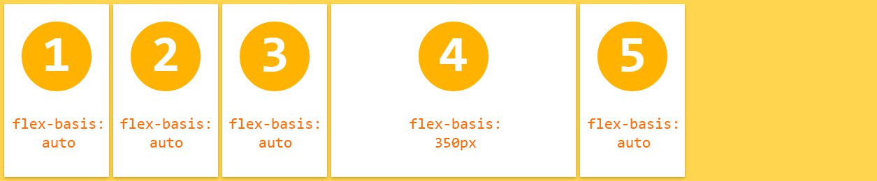
4.4 flex-basis
flex item의 너비 기본값을 px, % 등의 단위로 지정한다. 기본값은 auto이다.
.flex-item {
  flex-basis: auto | <width>;
}
4.5 flex
flex-grow, flex-shrink, flex-basis 속성의 shorthand이다. 기본값은 0 1 auto이다.
W3C에서는 이 속성을 사용하는 것 보다 개별적으로 기술하는 것을 추천하고 있다.
.flex-item {
  flex: none | auto | [ <flex-grow> <flex-shrink>? || <flex-basis> ];
}
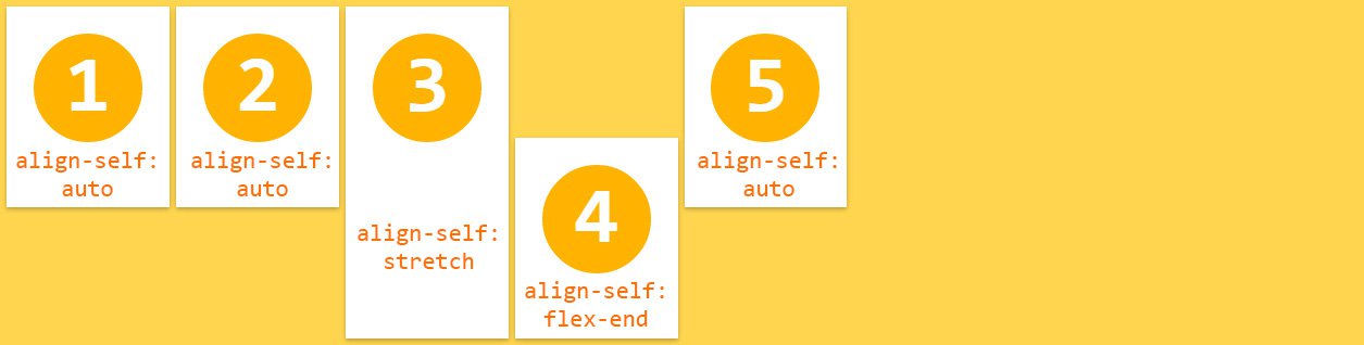
4.6 align-self
align-items 속성(flex container속성으로 flex item을 flex container의 수직 방향(cross axis)으로 정렬한다.)보다 우선하여 개별 flex item을 정렬한다. 기본값은 auto이다.
.flex-item {
  align-self: auto | flex-start | flex-end | center | baseline | stretch;
}
3번째, 4번째 flex item은 align-self 속성값이 우선 적용되어 정렬된다.
5. Flexbox playground
See the Pen Flexbox playground by Gabi (@enxaneta) on CodePen.